

Now you’ve all seen the front cover (click here if not!), I thought it would be interesting to delve into how it was created.
So to start things off, this cover was made by myself. The idea, the photo, the editing, it was all from my little noggin. Considering all of that, I’m still pinching myself at how beautiful the cover looks. It conveys exactly what I wanted and I feel it captures the novel perfectly.
The Original Idea
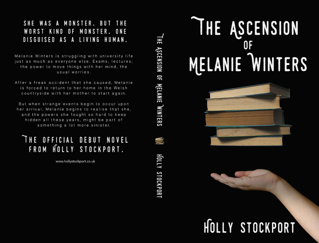
The idea has been in my head before I even began the second draft. It came from one of the reoccurring objects that is associated with Melanie and her powers during the book. I didn’t want to have a cover full of bright, bold colours; to me it wouldn’t have reflected the story well. For this, I initially opted to go for a black and white scheme with a simple hand levitating books. Literally. That was it. I felt that this captured the tone and idea of the novel perfectly.
The Front Cover Shoot
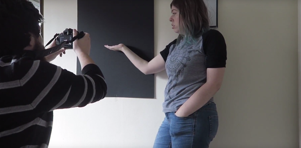
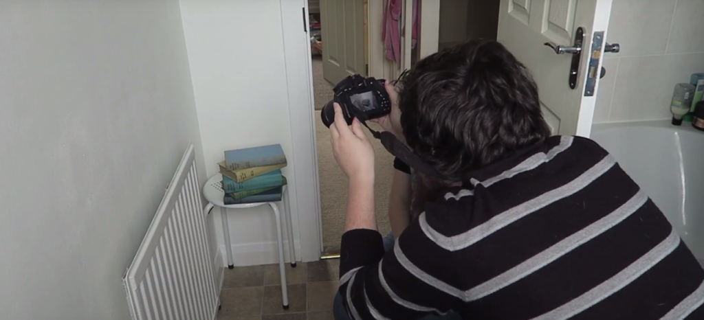
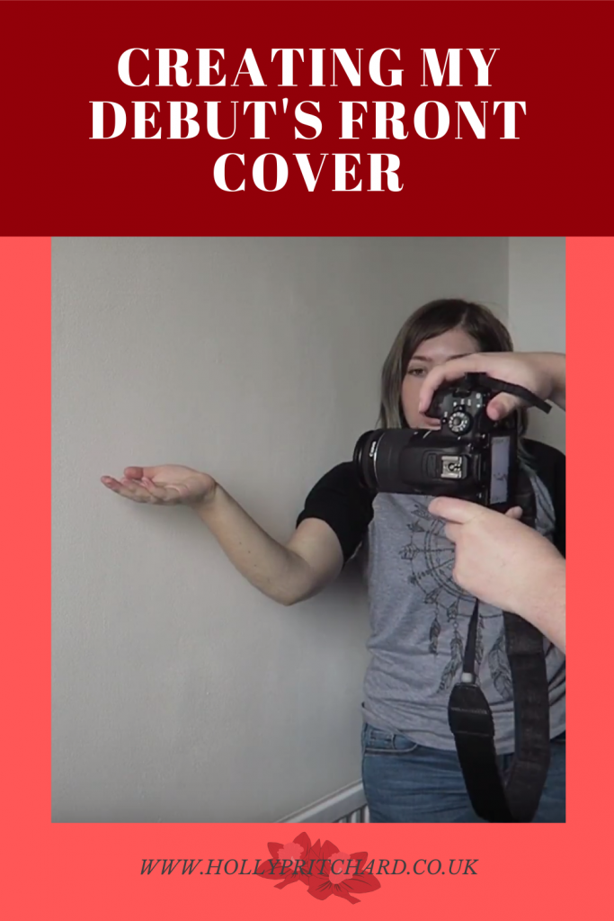
This was the part that proved to be difficult. As I was doing this all myself, I had to make sure I could trust myself. Morgan suggested I take a photo of my hands on a white background to see how it would look ; since we had just had our bathroom painted white, it was a convenient suggestion! To achieve the base photo, I picked up some A2 card from the Range and stuck it on my bedroom wall. I am the epitome of professional photography right here.
Then, I went and took two photos; one of my arm outstretched (yes people, that’s my arm on the cover!) and then another of a pile of books on a stool. Originally I wanted to use a few of my hardback books with the fancy covers taken off, but all the ones I own have their titles on the side and they’re pretty recent too! So for this, I borrowed some books off my nan and they did the job perfectly. The books in the cover don’t relate to the story, I just chose the ones that looked the most appealing. With my DSLR camera and Morgan helping me out, we got the two photos you can view below.
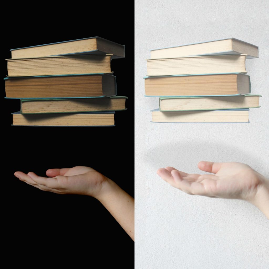
I think it’s pretty obvious to see why I ultimately went with the original black background idea…it just doesn’t look as good on a white one! And every time I look at the white cover I can’t help but think of it as my bathroom. So although me and Morgan both agreed black looked better, I’m glad that we did try out the white one to see how it looked.
Editing The Front Cover
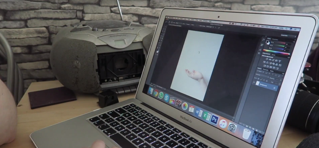
Once I was happy with the photos, I took them into Photoshop CC and began the editing magic. I made the background slightly darker than normal and added shadows where my hand was going to be. It was at this point that i decided not to go with a greyscale scheme and have it in colour; my reasoning for this was because I felt it would look very drained in complete black and white and I really liked the colours from the pile of books.
Taking the pile of books, I cut them out from one image and pasted them above my hand image adapting them so they would blend in with the scene and look realistic. After minor adjustments and tweaking, the cover was finally finished! I’m so pleased with how it turned out and still quite shocked I managed to get it to look as good as it does. Many people have already asked me who designed my front cover and it’s great to tell them that it was all me! The joys of self publishing.
The Front Cover – The Final Result
Pingback: My Stance on Generative AI - Holly Pritchard